The First Appointment Is a Map Layer: Prenatal Access in Refugee Arrival ZIP Codes
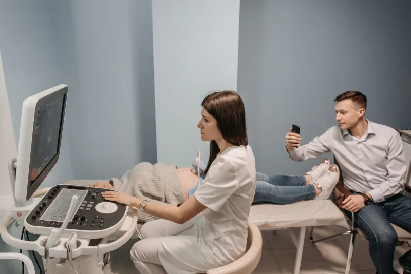
Refugee resettlement maps in the United States have become reasonably good at showing where people arrive. They are less good at showing what must happen in the first ninety days, when a new arrival needs a Medicaid card, a primary-care appointment, and, for pregnant women, a prenatal visit that cannot wait for the housing queue to clear. The clinic, not the caseworker, is sometimes the first institution that can confirm whether the resettlement map is working.
Why prenatal access belongs on the arrival map
Housing and school capacity have earned their place on refugee settlement maps because they shape the first months of resettlement. Health capacity deserves the same attention, but it is harder to layer. A ZIP code may contain a federally qualified health center and still lack a prenatal appointment. A hospital may have an obstetric unit and still be an hour away by transit. A provider may accept Medicaid and still have no interpreter for the language a patient speaks.
That gap matters because prenatal care is time-sensitive. Delayed entry into care is associated with worse maternal and infant outcomes, and the first trimester is often when Medicaid enrollment, transportation, and language support must all line up. For researchers and advocates, the practical question is not whether a ZIP code is near a clinic. It is whether a pregnant arrival can get a timely appointment, with coverage and interpretation, without a car.
A reproducible layer, not a ranking
The first step is to fix the arrival denominator. Resettlement agencies and state refugee coordinators hold address data, but exact addresses should not be published. Aggregate arrivals to ZIP Code Tabulation Areas or census tracts, suppress small counts, and state the time window. A map of arrivals from the past three years is not the same as a map of arrivals in the past ninety days, and the difference matters for clinic scheduling.
The second step is to inventory prenatal capacity from public sources. The Health Resources and Services Administration maintains a locator for federally qualified health centers. CMS provider data can identify Medicaid-enrolled prenatal providers. State licensing and hospital data can flag obstetric units, including those that have closed or reduced services. Local health departments sometimes publish sliding-fee schedules. None of these sources is complete, and each carries a date stamp that belongs on the map.
The third step is to measure travel burden rather than straight-line distance. Drive-time isochrones are useful in metros with reliable road networks; transit schedules are essential in metros where many arrivals do not drive. A clinic that is two miles away but requires two bus transfers is not the same as a clinic two miles away with a direct route. If a map cannot model transit, it should say so rather than imply that proximity equals access.
What ZIP-code proximity cannot prove
A clinic-access layer can show where prenatal providers are located relative to arrival ZIP codes. It cannot show that a provider is accepting new patients, that the next available appointment is within two weeks, that Medicaid is accepted, that interpretation is available, or that the front desk will not require a referral that a new arrival does not have. Those are operational facts, and they change faster than public data.
This is where many maps overreach. A red ZIP code on a prenatal-access map can be read as a failure by a resettlement agency, a warning about a neighborhood, or a justification for changing placement policy. But the color may only reflect the absence of a public provider listing. Researchers should publish a confidence field alongside every access measure: verified provider, public listing only, reported closure, or unknown. Advocates should resist turning the map into a scorecard before the underlying data can support that use.
A modest validation step helps. Navigators, clinic intake staff, and refugee health coordinators can review a sample of ZIP codes and flag known barriers: waitlists, transportation gaps, interpreter shortages, or clinics that have stopped accepting new Medicaid patients. This is not a substitute for systematic data, but it prevents a public map from making claims that local providers know to be false.
A pilot for six to eight metros
A defensible pilot would cover six to eight metros with meaningful refugee arrival and diverse health systems, such as Phoenix, Houston, Minneapolis–St. Paul, Buffalo, San Diego, Denver, Atlanta, and Seattle. In each, the layer would combine arrival density, prenatal providers, federally qualified health centers with prenatal services, obstetric units, Medicaid acceptance where public, and transit or drive-time access. The output should be a set of small-multiple maps and a methods note, not a single national ranking.
The first ninety days of resettlement are a sequence of appointments, and prenatal care is one of the few that cannot be deferred without clinical consequence. If refugee maps are going to treat housing and schools as infrastructure, they should treat the clinic the same way. The point is not to prove that a ZIP code is a desert. The point is to show where the map is thin, where the data are stale, and where a caseworker and a clinic need to be connected before the first appointment becomes a missed one.